Problem space
Overview
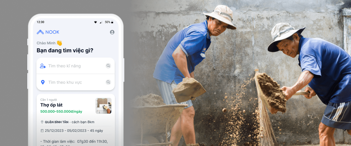
Nook as a job marketplace in construction domain, they help connect worker with contractor. In the early stages, Nook has posted jobs via Facebook and Zalo community and is now transitioning to an app. We have a proof of concept that demonstrates there is a market and our customers (worker and contractor) like it. Now it's time to test the hypothesis: customers can use technology (app) to obtain benefits. If successful, this value will be enhanced by automating and scaling it.
Persona
So who is our user? Our product has two main user groups: workers and contractors. However, in this case study, we are focusing only on the workers.
In short, workers are blue-collar laborers in the construction industry. They often have low income, low education levels, and are not tech-savvy. They usually look for jobs through traditional methods such as word-of-mouth or visiting construction sites directly. Some also join Facebook communities to find work.
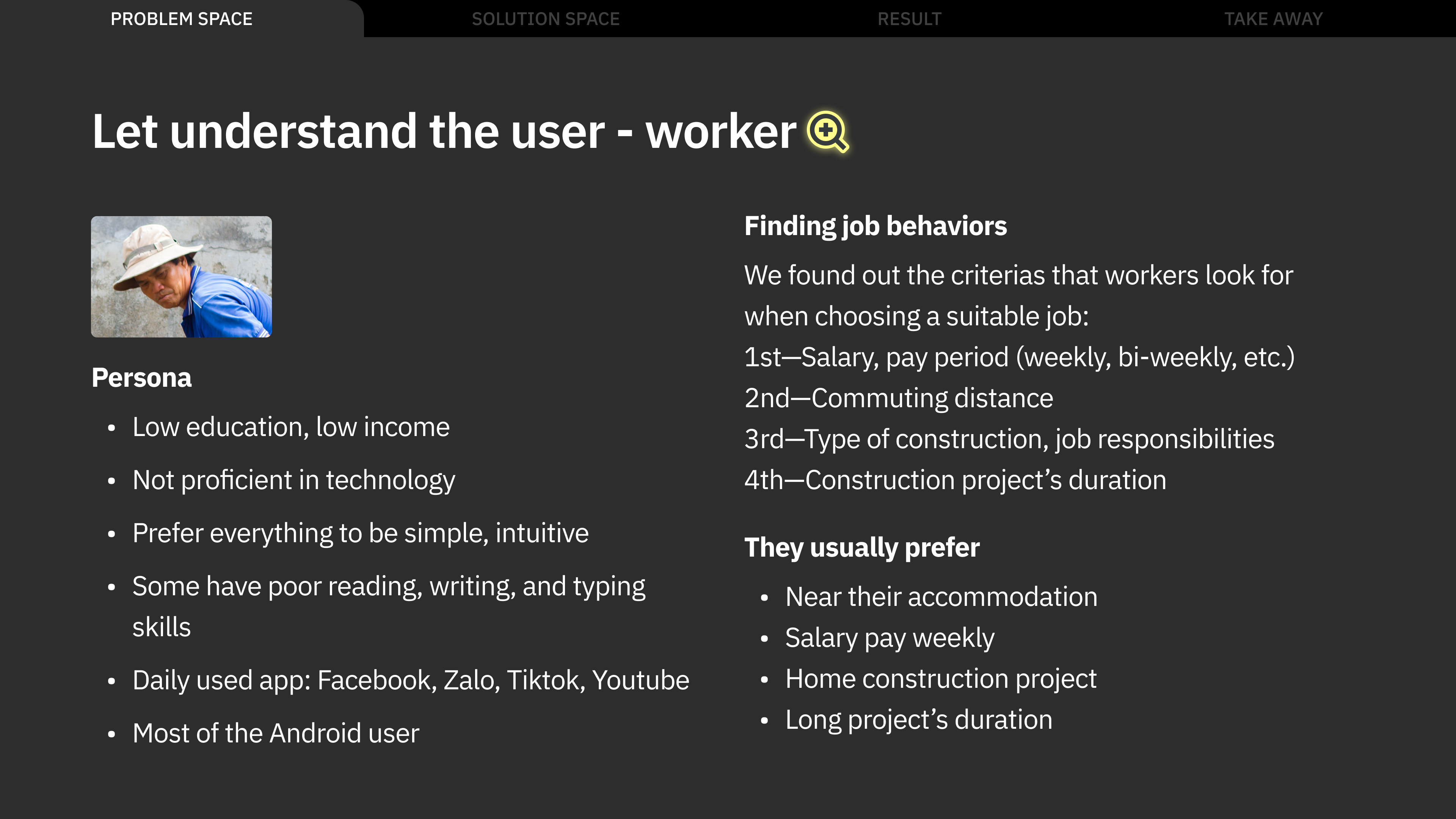
Current worker's pain points
- Quantity of job
They need lot of time and effort to browse posts on multiple Facebook group to find a suitable job and hard to compare each opportunities. - Lack of job detailed information
Job post on Facebook not let them know detailed information, so that they need to call or chat with contractor to collect more info but sometime contractor miss the call. - Identify quality contractor is hard
They can’t identify quality contractor, they afraid of salary fraud or late salary.
Solution space
🎯 Objective: Worker can find a job easily
So what does it mean “easily”?
- Quantity of job
Nook will become a place where worker can access more opportunities than anywhere else. - Suitable job
Workers can easily find a job that matches their expectations. - Less effort to consider
They take less effort to have detailed job information and consider quality contractor.
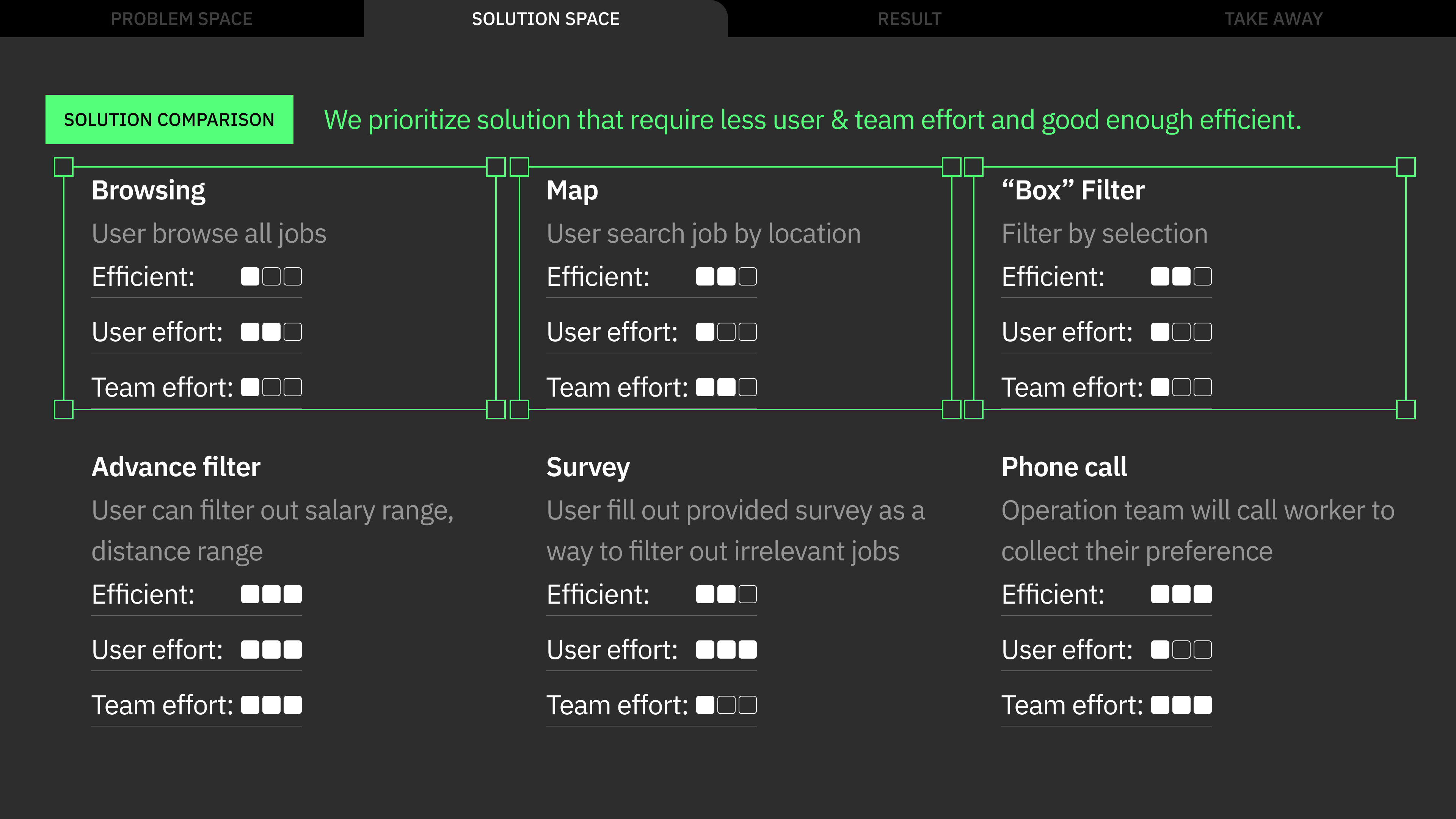
Solution exploration
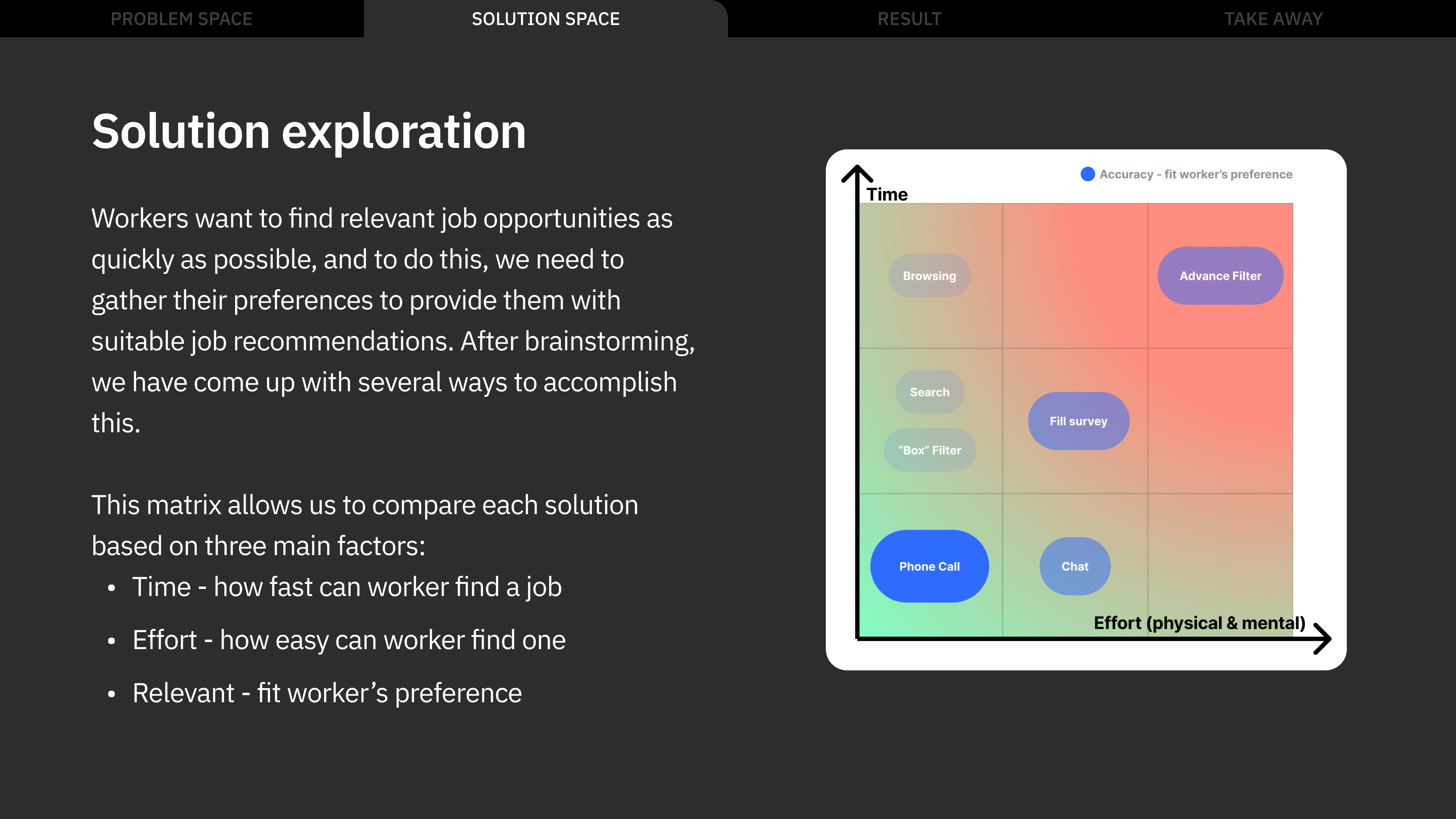
Design
Initial concept: base on user's behavior that they have expressed a preference for finding jobs that are located near their place of residence. Therefore, it would be beneficial to display job listings on a map.
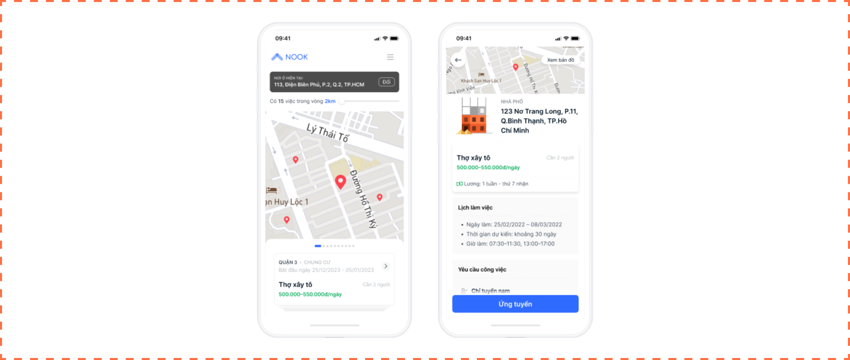
But, we face two constraints if we pursue this approach.
- Viability risk
Users are now able to show up at the construction site and inquire about job opportunities, instead of applying through the app. This approach may not be beneficial for us in the long term. - Operation constraint
Frequently, we are unable to obtain the complete address from the contractor, which makes it impossible to display on a map.
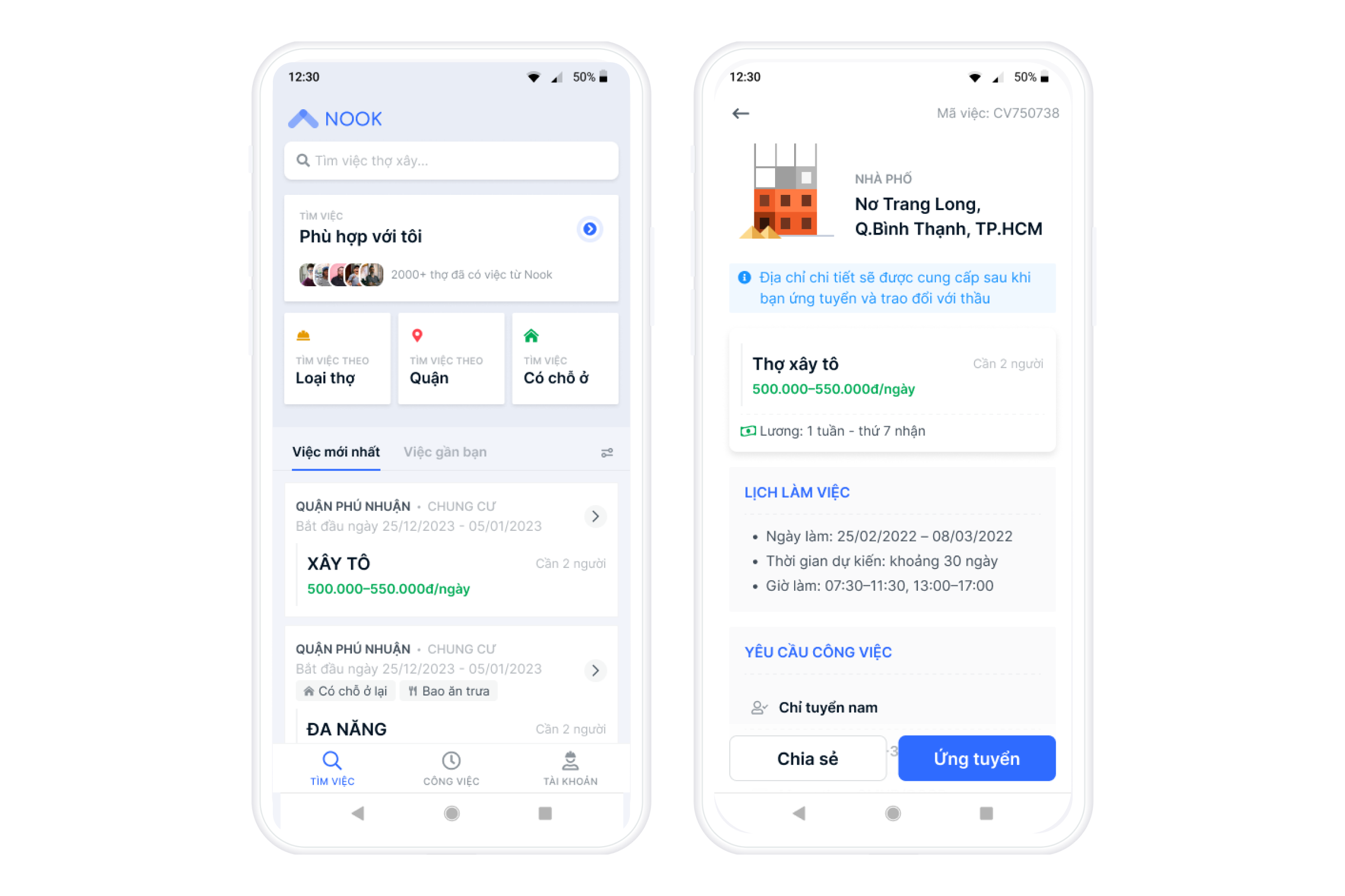
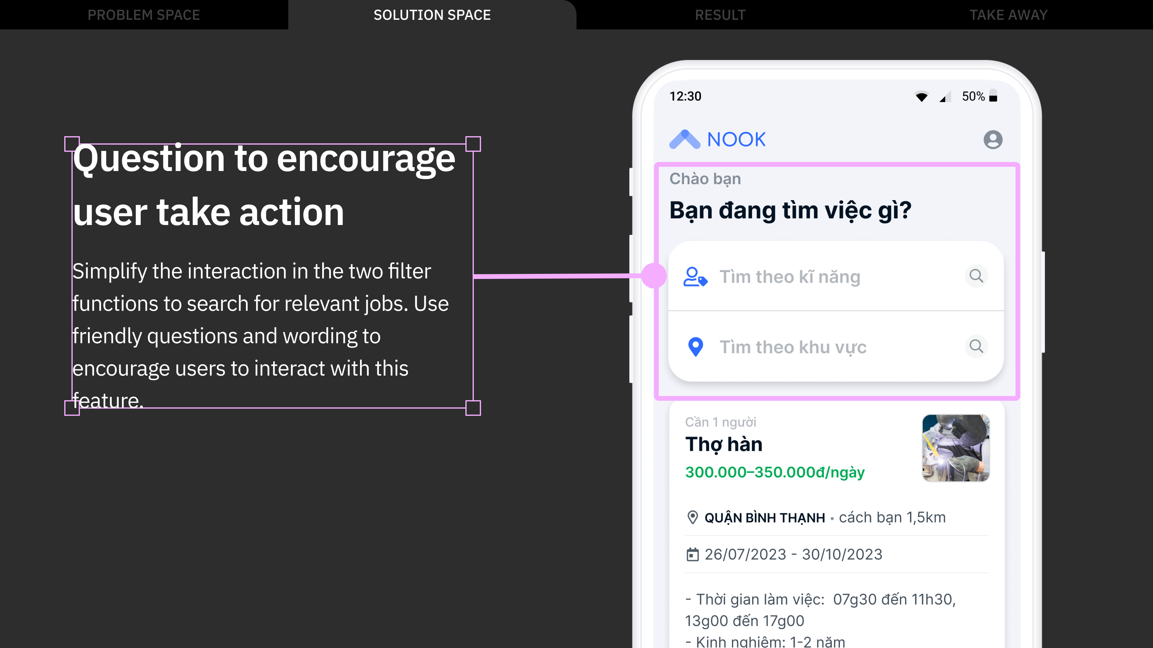
Therefore, we had to approach it with a different concept: a job listing format with accompanying filter and sort features.
According to the goal of helping users quickly find suitable jobs, it seemed reasonable to have users answer a short survey after logging in, which would then display a list of relevant jobs. However, this idea came with a trade-off: depending on the worker's criteria, the job list could end up being too short. At the same time, we wanted to create a strong impression that the app offers a wide variety of jobs. After evaluating this, we decided to discard the survey idea.
Testing & Finding
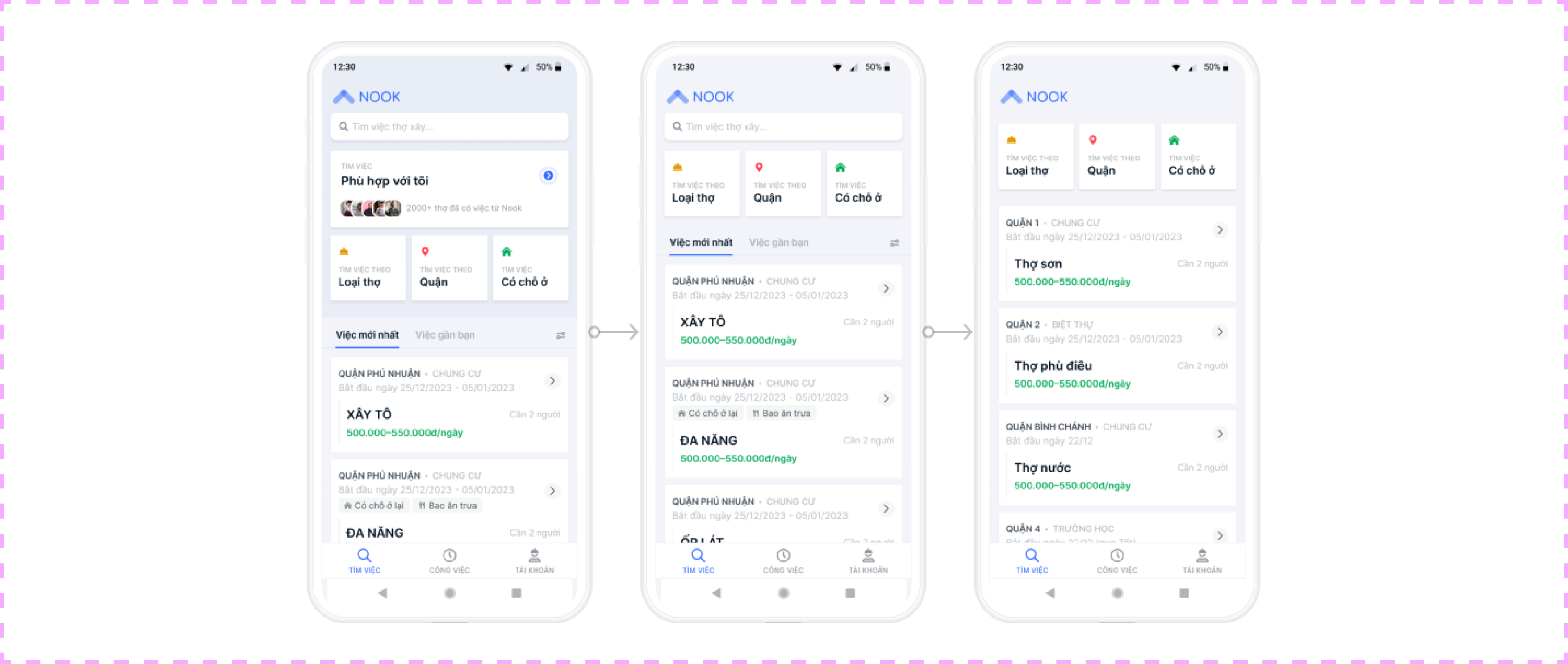
After several iterations of refining the concept and design solution, we arrived at a version we were quite satisfied with. The next step was to gather user feedback on our solution. As soon as we had the prototype ready, we conducted user testing and interviews. We want to validate: Intention of use; usability; mental model.
We had 6 testing session with workers, here are some key findings and ideas for adjustments.
Finding: workers still find it challenging to use it to find job smoothly.
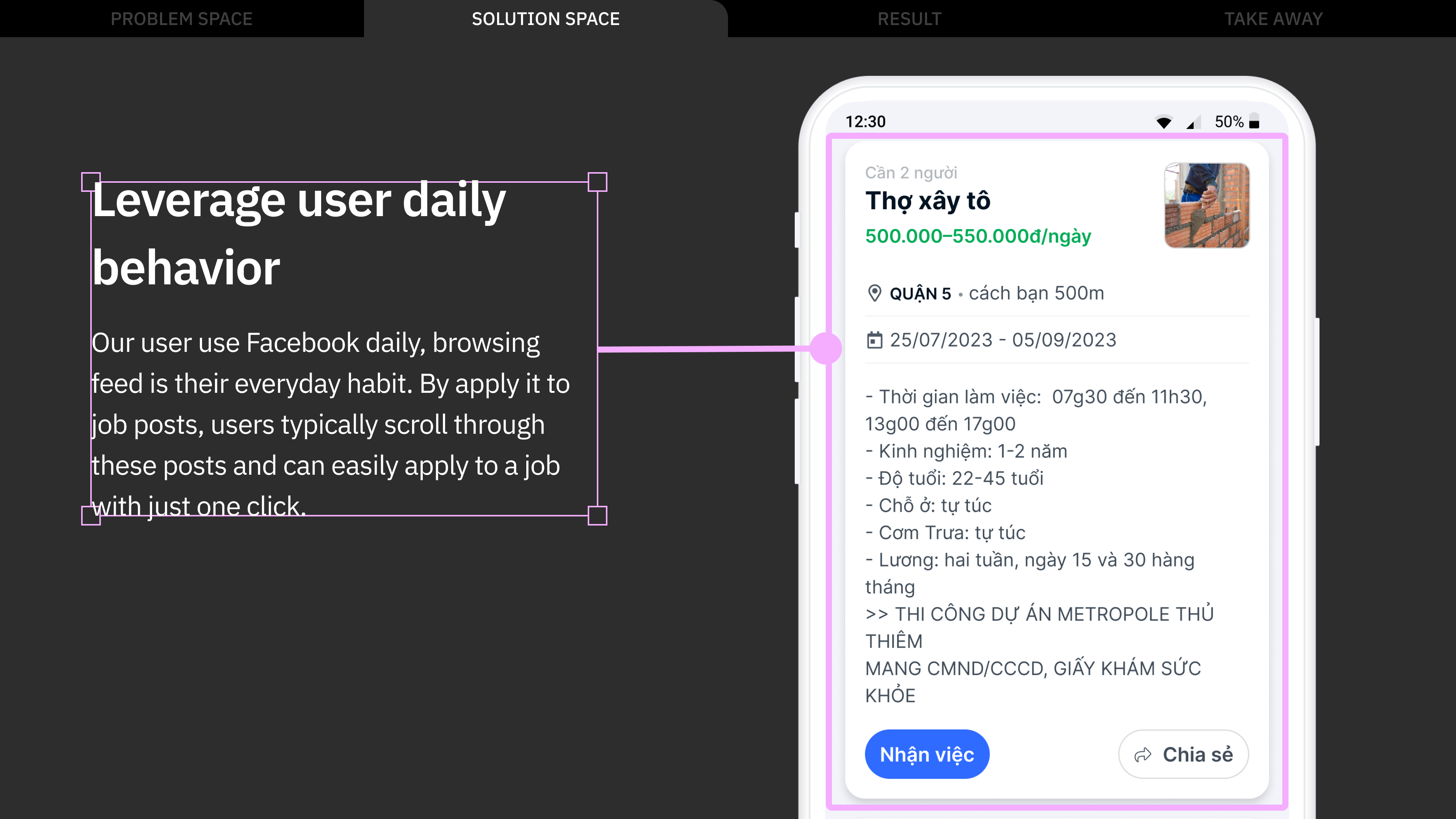
- The users are not willing to use the "box" filter feature, but instead, they prefer to scroll through the page in a manner similar to how scrolling works on Facebook to find job.
- The users do not want to click to view each job individually.
Ideas for adjustment
- The "box" filter should be encouraged for use, as it displays appropriate job feeds for the user to scroll through.
- Reduce clicks by making the job feed viewable directly instead of requiring a click to view it.
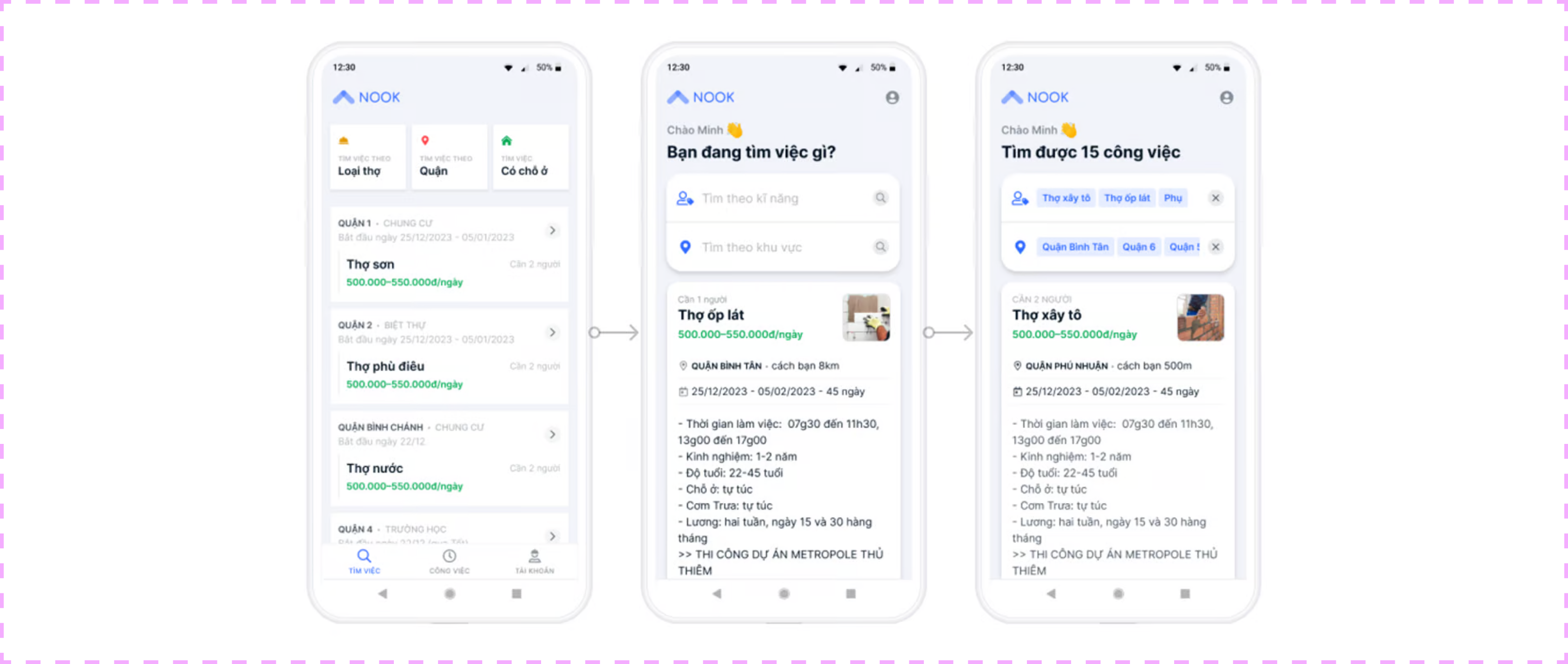
Final design
Result
600 users
After 1 month, successfully convert 600/800 users from Zalo group to app.
75% conversion rate
75% users can apply job via app.
Key learning ☕
- Design needs to do more than just meet user expectations, but we also need to align the design with the business's goal and constraints, consider technical feasibility and operation’s effort.
- Usability is more important than beauty. While some layouts may not be visually appealing, but users can use them effectively.